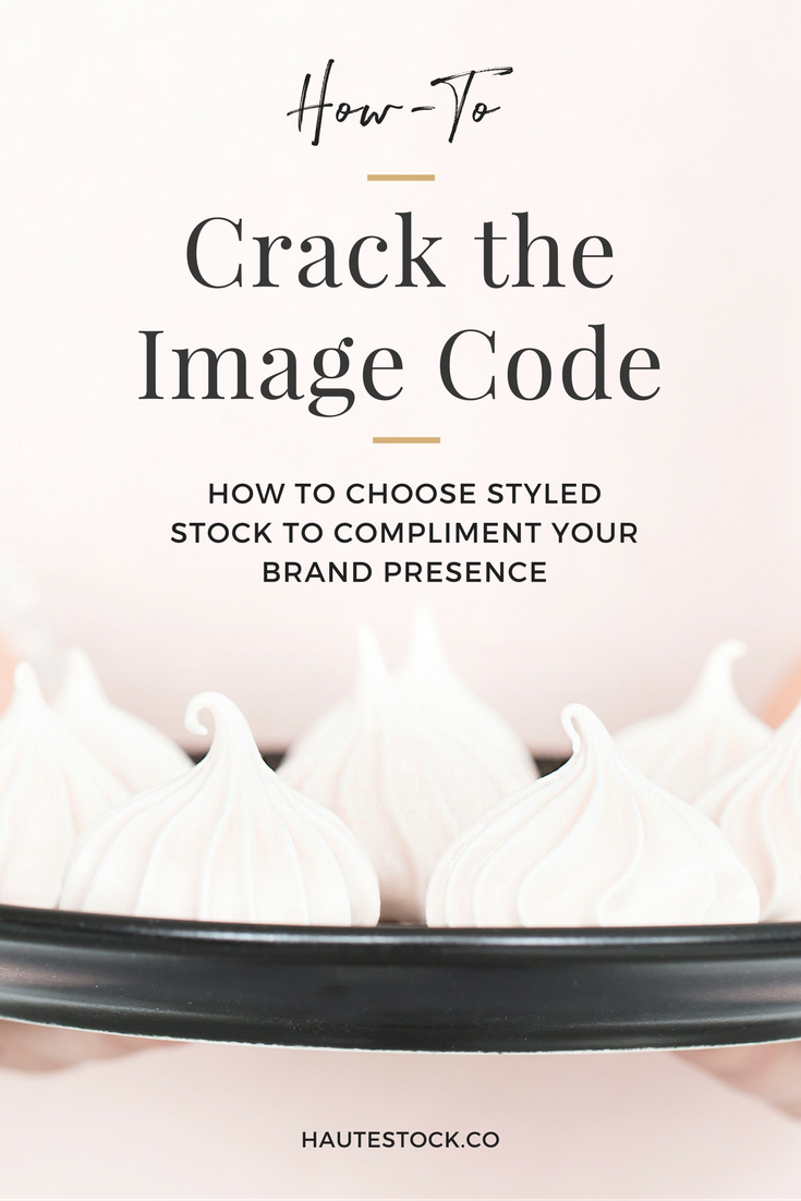
How to Choose Styled Stock Photos For Your Brand
In our last tutorial, we deconstructed a pop-up design and walked you through our full design process from initial concept/idea, to inspiration, color choices, type choices, and on to the full design and layout.
We even shared additional examples to show how you can change the entire look by changing up the colors and typefaces. If you missed it, be sure to check out the video tutorial: Master the Design Process to Create Pretty Pop-ups!
In this How-To, we'll be cracking the image code to give you a few creative tips and tricks when looking for styled stock to expand your brand!
With social media leading the charge for small businesses to share their services and products to the masses, even the best product or service can fall flat without the right style or quality of imagery.
It can get down right daunting when you look at your social media plan and realize that not only do you need high-quality and engaging graphics for your website, but you also need them for SO. MUCH. MORE!
You have your daily social media posts across multiple platforms like Instagram, Facebook, and Pinterest, along with any other graphics that you plan to use to promote your latest blog post, new product release, etc... It's enough to make your head spin! So what's a business owner to do?
Well, read on for FIVE ways to pick images that will give you the most versatile use of styled stock — to save you time, money, and take the guess work out of selecting images to give your brand a visual boost!
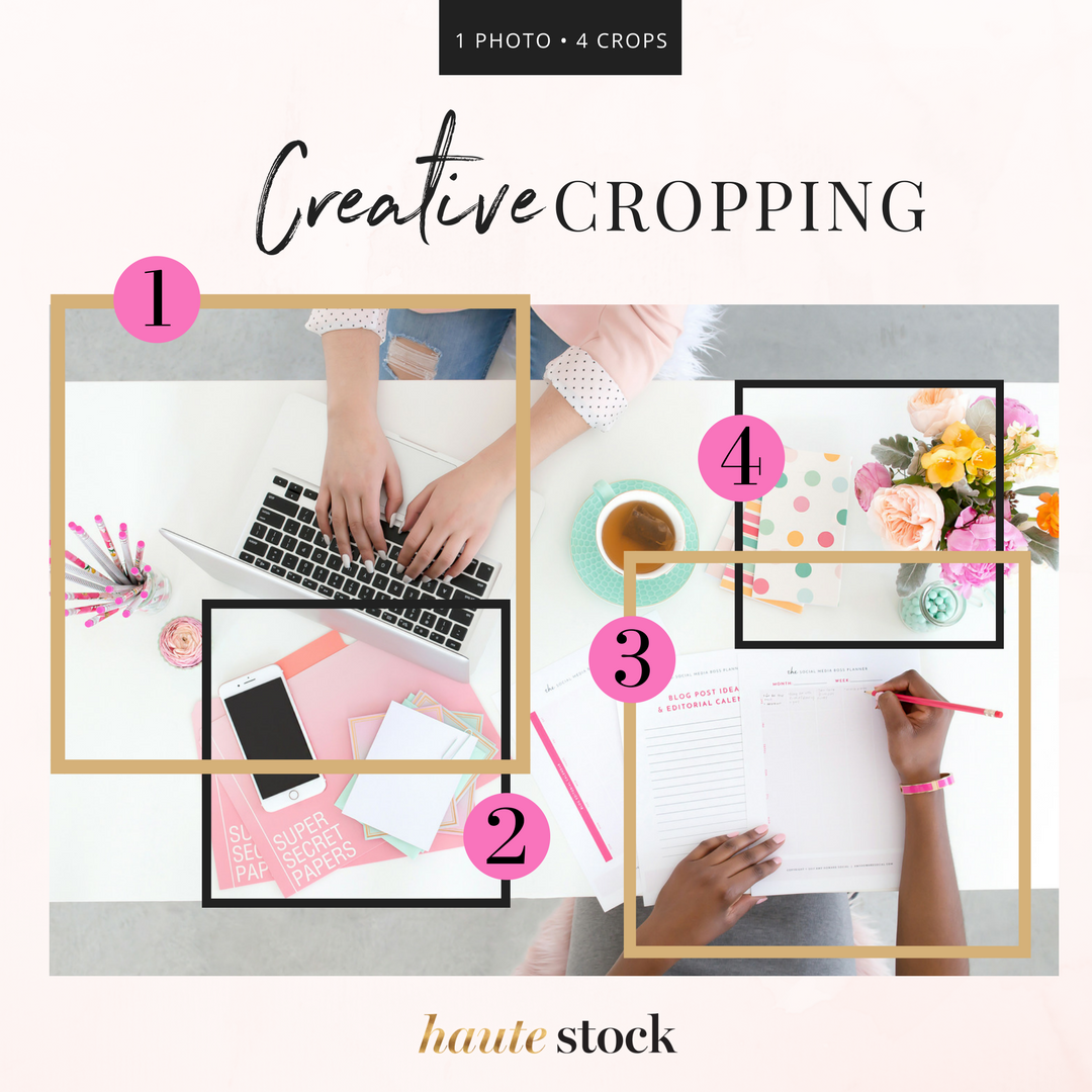
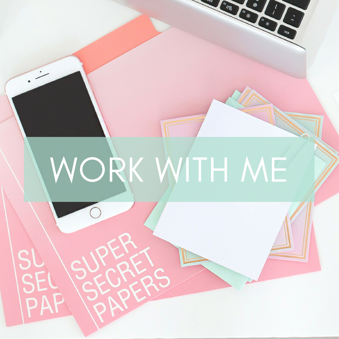
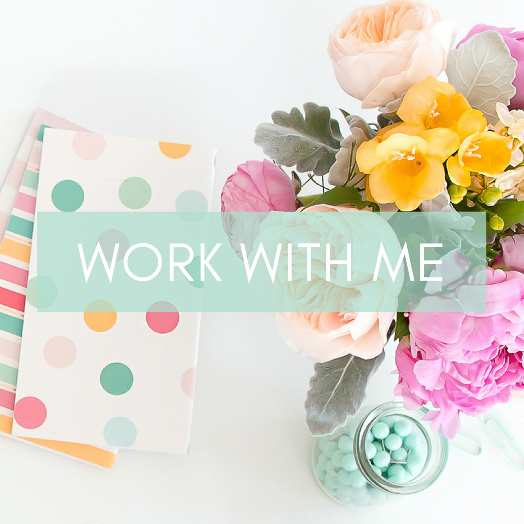
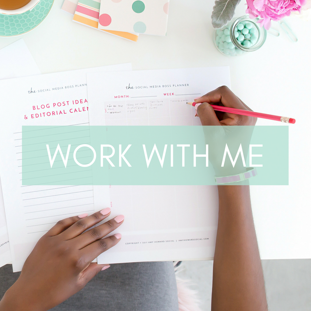
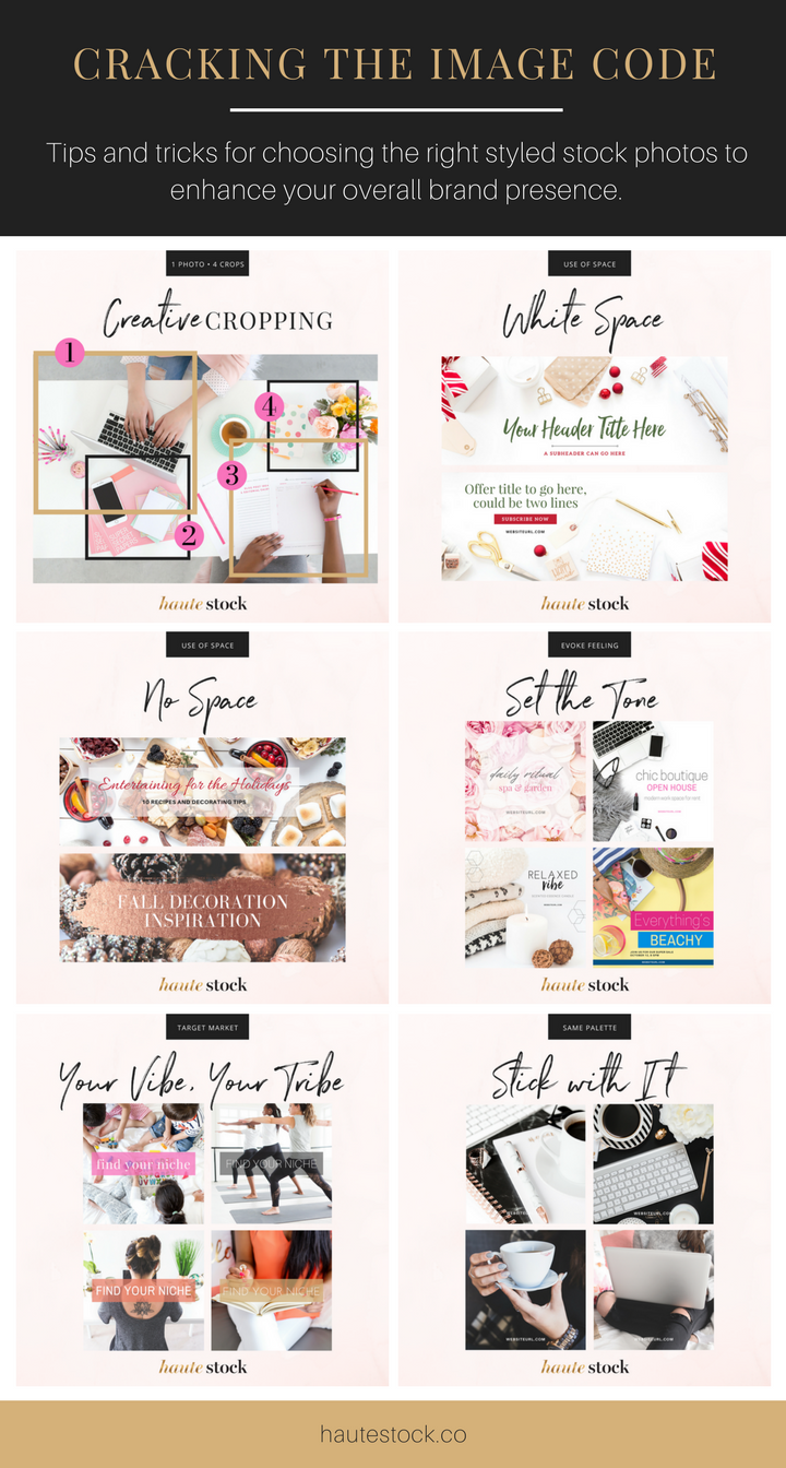
1 / Select images that can be cropped in a few different ways to keep consistency, but still provide variety in composition.
By selecting images that you can zoom in on, rotate, and crop, you're able to gain a consistent look/feel across your brand images without having to search for multiple images that give off the same vibe. By doing so, you'll get several uses out of one image, saving you valuable search time and keeping your visuals on brand.
Pro Tip: Select images that, when cropped or zoomed in, have a unique look of their own, but still stay within your overall brand styling. If you are using a flatlay photo, look for images that either have low to no shadow, so if you rotate the photo, the viewer can't tell that the image has a shadow that's out of place.
To see how you can crop a single photo in 4 creative ways, check out the example below. This image is from the Haute Stock Brights Workday Collection.
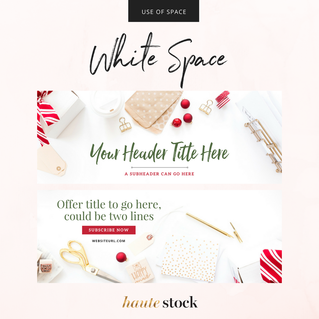
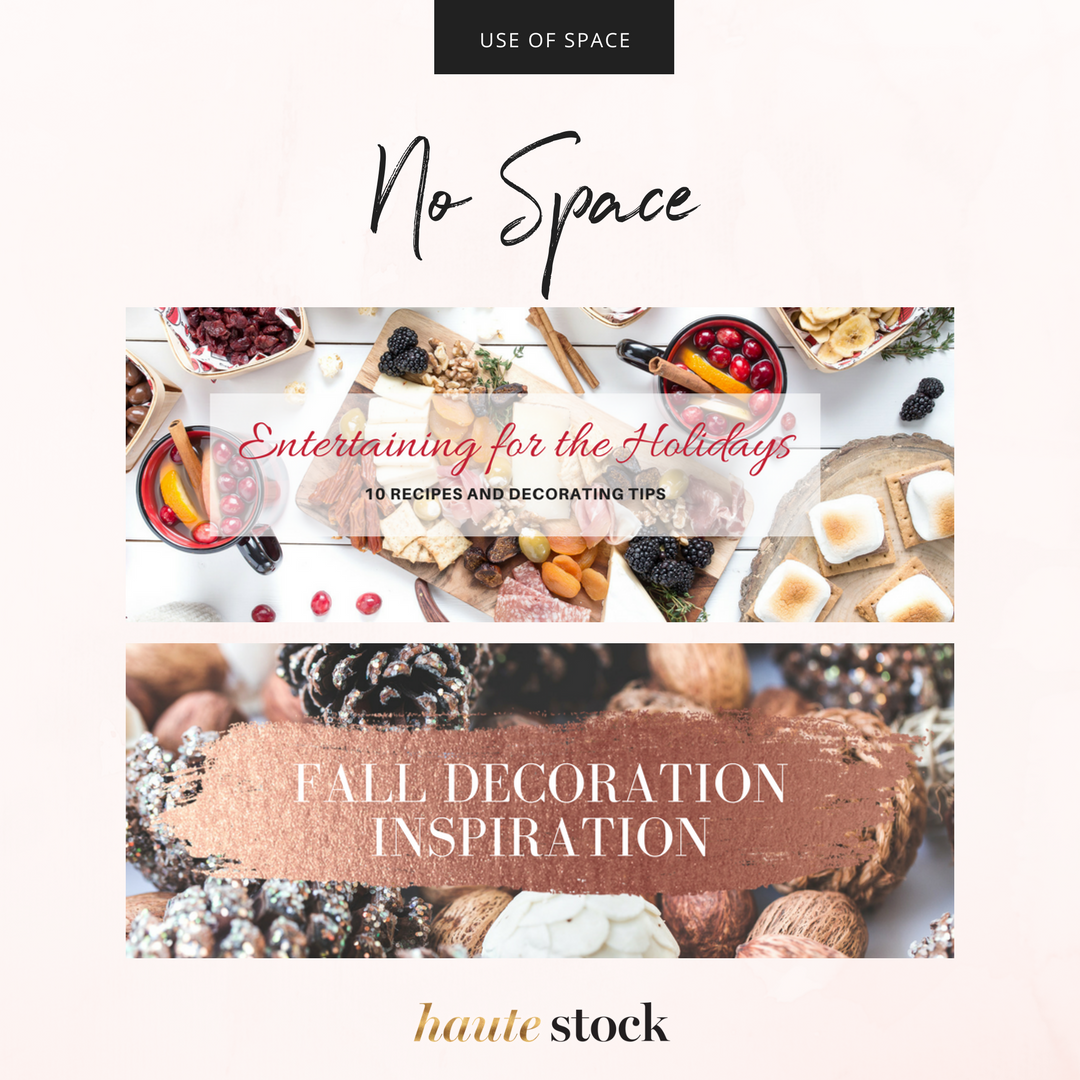
2 / Look for Images with White Space...or NO White Space.
These type of images are so valuable for your brand because images with strategic white space will allow you to customize them with copy, headlines, title, products and more. Think of these as your personally styled billboards that you can customize to fit your needs without too much work or Photoshop magic.
Same goes for images with little to NO white space. Why? To mix it up, of course!
Pro Tip: Look for images that are different orientations and sizes. For example, choose a horizontal image for headers and vertical layouts for blog post graphics, Pinterest and more.
Select images that use the same props or overall tone and style to bring all the different areas of your brand graphics together seamlessly.
For those images that have little to no white space, add a transparent or colored overlay or other use a graphic to make your title pop.
Check out the examples below to see how images with and without white space can be used to display your copy. The photos used are from the Haute Stock Seasonal Collections.
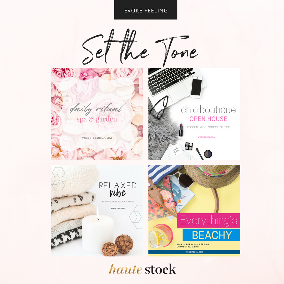
3 / Select images that evoke a specific feeling or match your messaging to give your graphics a personalized feel to them.
Looking to evoke a specific feeling like warmth, vibrance, or très chic for a special offering or event? Search for images that will instill that vibe and resonate with your audience. Don't be afraid to use images with objects like flowers, blankets, hot cocoa, or beach items — props that compliment the messaging will enhance those #feels.
Check out the examples below see how pairing the right image with your text will create an effective visual graphic. Even if the image may not be in your brand colors, using your brand fonts, adding an overlay, and including your website url will ensure the graphic is on-brand.
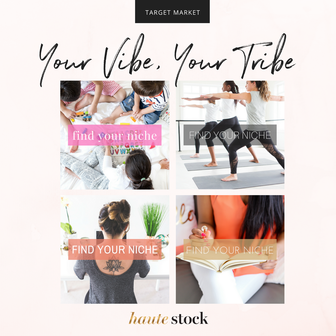
4 / Use images with people in them to connect with your target audience.
How would you define your tribe? Are they classic and chic, super trendy, hipster, whimsical, or boho?
Finding images with people that possibly resemble you or your target market can form an instant connection between your content and the user. So don't be afraid if every image with a person in it is not you — you can still be consistent in your brand messaging even if you use other people in the images you select.
Check out the example below to see how you can use images with models to connect with your tribe by using images with people that resemble you and your tribe, not only in looks, but in dress, activity, and overall vibe. These type of images will resonate with your audience because they can see themselves in the images you're using.
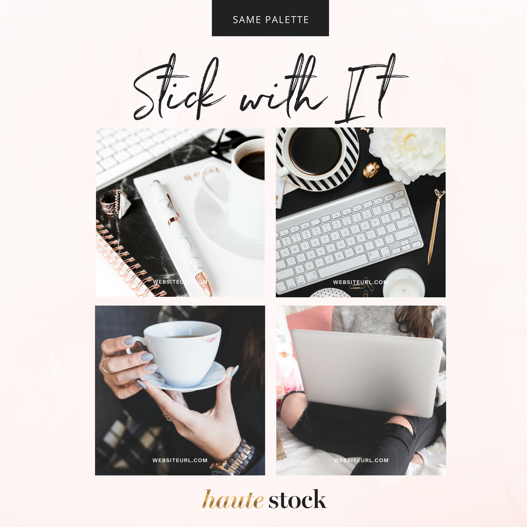
5 / Use images with A matching color palette.
Using images with a similar color palette is one of the easiest ways to get more out of styled stock. By sticking with a clear palette, you'll find it much easier to determine which images will or will not compliment your overall brand aesthetic. Now, you don't have to be matchy-matchy to a T, but by keeping the base palette consistent, you can then use different pops of color throughout the year and for special occasions that will still keep everything looking professional and fresh.
Pro Tip: By sticking with a neutral base palette, you can get creative by using close ups, tight crops, or pops of color throughout your selection of images. No need to go stale with the same thing over and over again, feel free to experiment to bring your brand images to life!
The images below are from four different Haute Stock collections, but have a similar color palette that keeps this glam brand consistent.
So there we have it! Five clever ways to pick and choose styled stock to further enhance your brand. We know selecting images can be overwhelming, but it doesn't have to be — you just need to start looking at the photos in a different way and it'll get easier and easier to find and use your styled stock images to compliment and enhance your brand!
Here's an overview of the five ways you can make styled stock photos work harder for your brand. Pin this graphic and save it as a reference for later!
We hope this post has given you more confidence to choose and edit styled stock photos for your brand!
The Haute Stock Library is the perfect resource if you're ready to elevate your branding with high-quality, beautifully styled stock photos.

This post was written by LeAnna Weller Smith: Executive Creative Director, Weller Smith Design & Design Expert, Haute Stock