10 Fonts we Love for Creating Sales Graphics & Why They Work
Using the right Font is a key ingredient for creating effective designs
Typography can help emphasize key information, set the tone and add different levels of interest to your graphic. Just read the following words and tell me your brain didn’t just read each one differently….
SALE, sale, sale!
All the same font, yet making the word bold or italicizing it can change our interpretation.

This post will help build a solid foundation so you can create high-quality sales graphics for your business that look polished and professional.
The fonts featured are available on Canva, or if you don’t have Canva then you can easily download free fonts (take a look at one of our go-to’s for commercial use, Font Squirrel).
The Fonts We Currently Love:

Important things to consider when you’re looking for fonts:
Legibility - Are the fonts easy to read? You don’t want your customers to be struggling to read your graphics because you run the risk they’ll lose interest or miss important bits of information!
Especially for sales graphics - keep your fonts simple and avoid using script fonts for lots of text.
Type Characteristics - What fonts do you feel represent the tone your graphics are trying to portray?
Sans-serif, serifs, handwritten, cursive or display - each font category can give off a different vibe. Pairing fonts with different characteristics together can help depict a story but also add layers of interest that make your design more dynamic than using a single typeface for your entire graphic.
For example: sans-serif fonts are more modern, serif fonts tend to side more on the traditional side and cursive fonts can add a feminine touch.
Font Families - Does the font you’re using include different weights (regular, thin, bold, heavy, italic)?
This isn’t necessary but it can be a handy and simple way to emphasize different phrases within your text while ensuring the fonts do not clash because they are part of the same family!
Putting It All Together:

The Fonts:
Abril Fatface
Beautiful
Aileron Regular
Abril Fatface is a bold, thick font that works well for main messages because it stands out and makes an impact. Beautiful’s cursive depicts movement and encourages viewers to take action and swipe up while Aileron is the perfect sans-serif font to use for important information because it is easy to read.

The Fonts:
Bodoni FLF
Poppins Medium
Bodoni FLF is a serif font that adds an element of class and sophistication to this graphic and Poppins Medium is bold enough to get noticed while displaying important information in a clear way.

The Fonts:
Charlton
In this graphic, Charlton is used both for the main message and the subtext, but because they are used at different sizes, it almost looks as if you’re using two different fonts. You want your main subject to stand out first, and then have the call-to-action be the next phrase that your viewers read.

The Fonts:
Fiona
This graphics is another example of using a single font at different sizes to properly convey the important subject information first then the call-to-action next. If you want to get really fancy in design speak, this is called hierarchy.

The Fonts:
Bodoni FLF
Glacial Indifference

The Fonts:
Charlton
Aileron Thin
In these graphics, the typography fills a great deal of negative space within the image. Charlton & Bodoni FLF are bold eye catching fonts. Whereas Aileron Thin & Glacial Indifference are simple and easy to read. You wouldn’t want to choose a cursive font like Beautiful for the important information or word heavy copy within your graphic because it strains your viewers eyes, and who wants that?!
To Summarize:
Font selection deserves just as much attention as your background images for your sales graphics! Before you get started designing, choose at least two different fonts that pair well together and try to pick fonts that feature different characteristics such as serif, sans-serif, or display.
Decide which information you want to highlight within your copy and in which order. Then choose your fonts accordingly based on the hierarchy you want to create within your graphic.
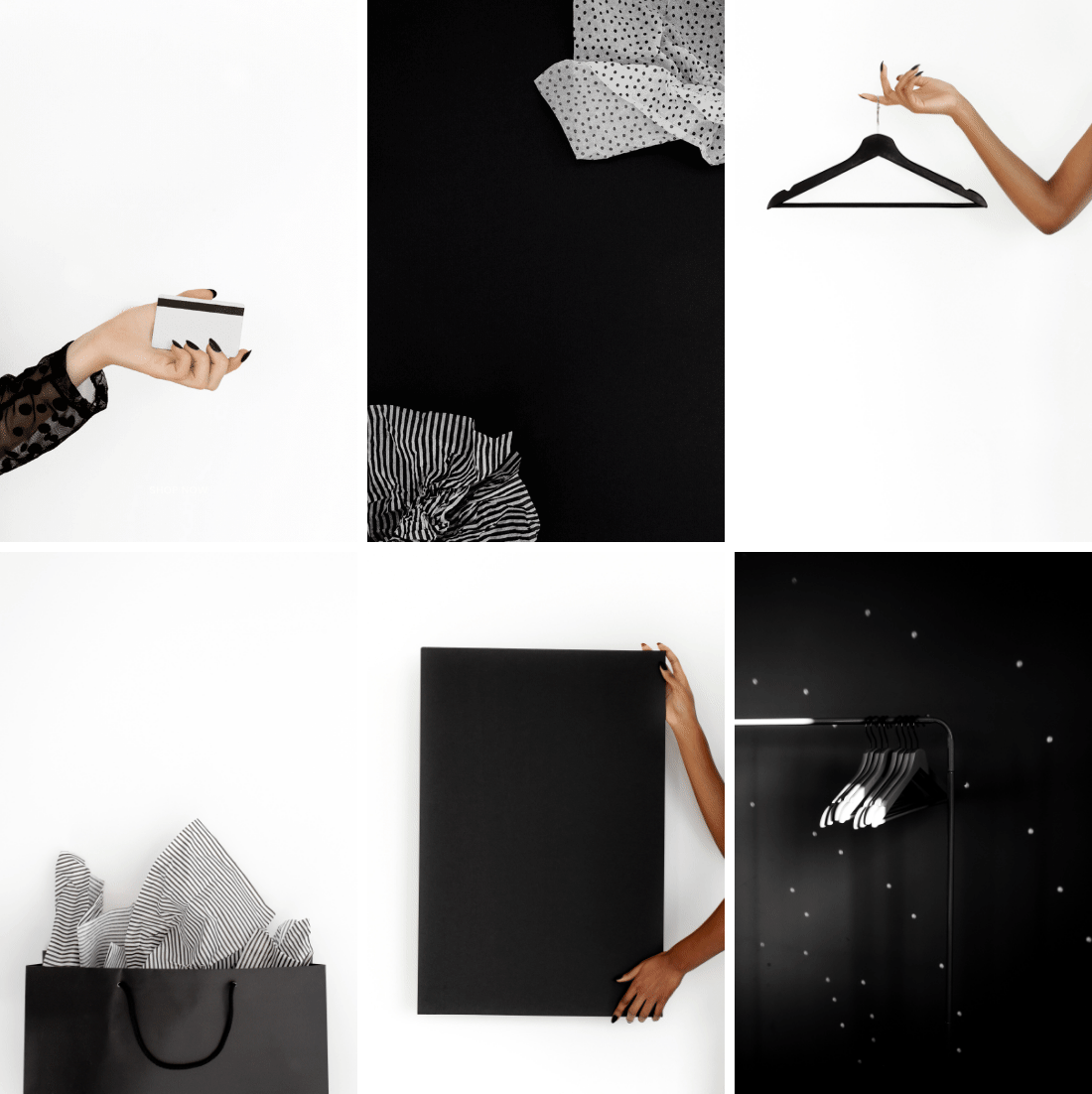
Using the tips we’ve given you in this post + images from our Black Friday Collection, you’ll be able to create professional looking sales graphics in a snap!


Need these images for your sales graphics?
Get instant access to over 4000 images & design assets with a Haute Stock Membership